Packaging does not function in isolation; it must operate as an identity in multiple context: within a family,
within a series, within a larger corporate identity, as well as within the retail environment.
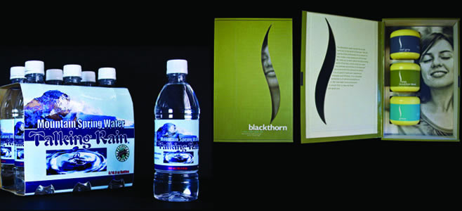
The Talking Rain bottled water developed its brand identity through a series visual textures
such as colors and imagery in addition to typographic treatment to the brand name and support
text to put together the essence of what the bottled water was all about. All these visual
elements were carefully studied and weighted in making sure they all add in striving to create an
engaging, clear and memorable expression of the brand.
The same process is taken into full consideration in creating the Blackthorn Tea Packaging.
The individual package designed to house the three different flavors, and should fully reflect the
logic and essence of the product. The rule stays the same: all visual elements should operate
together to generate an engaging, clear and memorable expression of the essence of the product. The series
should have a strong gestalt unity between parts when presented as a group.